Search
The Evolution of a Movie Poster
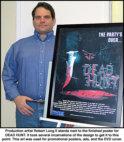
©2008 by Robert Long II
DEAD HUNT‘s Premise: Ten internet movie reviewers are systematically hunted in a creepy warehouse, after being invited to a party by the owner of a website devoted to horror films. Those that fall victim to the deranged killer are dispatched in grisly, gory, sadistic ways. Can they trust one another enough to survive the night? Is the maniac a disgruntled horror fan that has crashed the party? Is it someone within the group with an axe to grind? DEAD HUNT holds the answer…
This article is of how the Dead Hunt poster came about for the Timewarp Films’ production. The design went through fourteen different looks; nine of them are posted here. This will give a little insight into everything that goes into the evolution of a movie poster/DVD insert. I used a scanner, Adobe Photoshop 7, Adobe Illustrator 10 (for logo design), a large variety of photographs supplied to me by Leanna Chamish, Eric Strauss, Steve Pattee, John Kinhart, Don Dohler, and Joe Ripple. The resolution I was working in was 300 dpi.
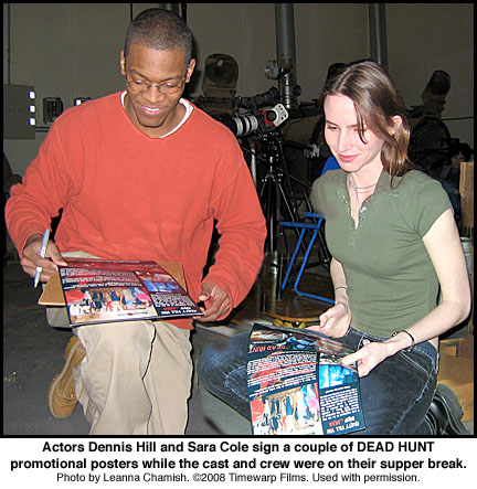
I started the poster designs while the movie was still in production. I sent both Producer Don Dohler and Director Joe Ripple images of the design in-progress. They in turned shared them with the cast and crew during the shoot. I know from talking to the cast that seeing the art helped to keep them pumped during the scenes. THAT is a great compliment. But let’s start talking about the designs themselves:
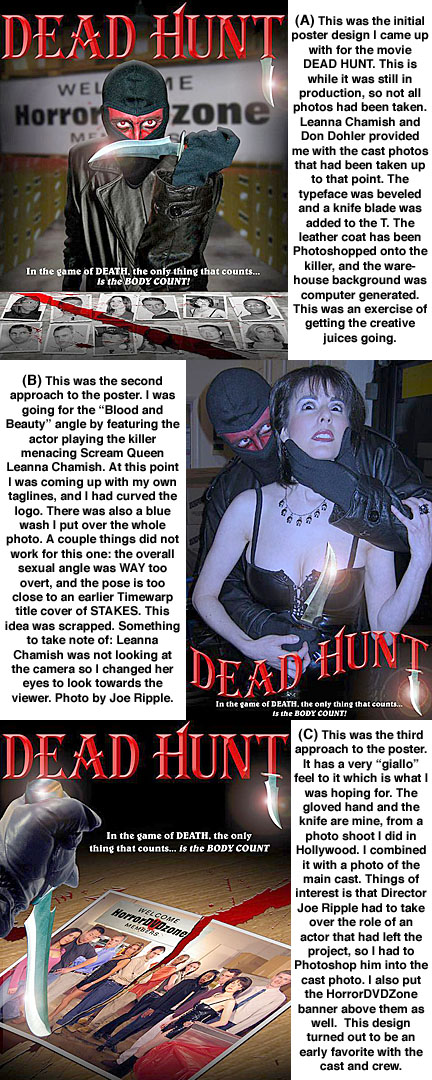
Poster rough A: The actor playing the killer was not wearing the full costume, so that leather coat on him is completely Photo Shopped on. The font was beveled in PhotoShop and the knife blade added. The background is partially computer-generated with real photo elements. The table in front of the killer has the cast photos with blood splattered on them. This was a starting point.
Poster rough B: This was going for a little exploitation – blood and beauty. The actor playing the killer was not wearing the full costume, so this shot wasn’t going to work as it was. I changed actress Leanna Chamish’s eyes to look more intense for the scene. The design has a blue cast over it to give it that dark corridor setting. The font was curved and beveled in PhotoShop and the knife blade added. To be honest I don’t think anyone involved thought this design would go anywhere; it was more of an exercise to get the creative juices going.
Poster rough C: This has a very giallo feel to it with the gloved hand taking the knife through the photo. I have always enjoyed slasher films that use photos to show how many of the victims have been knocked off. The hand is my hand and I am holding a retouched knife. Director Joe Ripple took the photo of the cast which I later doctored. The wood table, blood, and knife glow were photo-shopped in. I always liked the tagline I came up with, but I think the Producer and Director weren’t 100% for it. The logo is the straightened version of the logo from poster B.
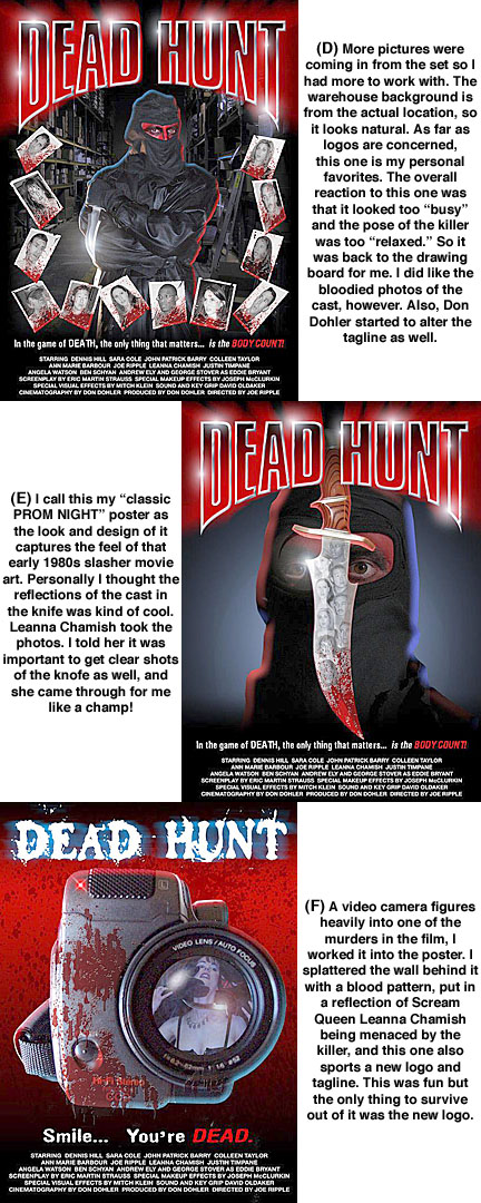
Poster rough D: This is my all-time favorite of my early roughs. I like the metallic lettering. Leanna Chamish took the photos of the killer and the warehouse background. She was crucial to this project when it came to getting me the elements for the poster. Again, I am a sucker for the bloodied photographs of the potential victims. At this point the whole cast is on the poster. I think I like this because it is a clean design and not a SAW wannabe looking poster.
Poster rough E: This is a favorite of mine. It has a very classic “PROM NIGHT” horror movie look to it. The look the killer is giving is not “Bwahahahahaha!” evil, but more of a chilling “You’re dead” looks. The knife is a Montana Tracker and is the one used in the film. In the reflection is the entire cast. I wanted everybody to have a shot at being on the poster, but it may have become too crowded. The metallic logo is a favorite of mine, though perhaps it looked too “Heavy Metal album cover” looking.
Poster rough F: This is the first appearance of the typeface Don Dohler and I agreed upon (we went through over 100 typefaces) and would last up until the final version of the poster (there we used Designer Sean Quinn’s logo as it was the one used for the opening title). This is a camcorder-theme poster as a camera has a part in the plot. I like the blood-spattered wall and camera. The camera lens has a much better image of actress Leanna Chamish with the killer – this was from a different photo shoot. The new tagline was simple and to the point. If I remember correctly, neither Joe nor Don were crazy about this poster, so the idea was scrapped.
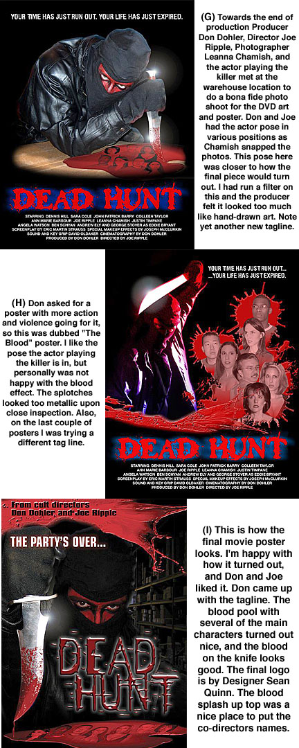
Poster rough G: This was getting closer to what the final poster concept would be. This was from an entire photo shoot specifically for the poster art. Joe Ripple and Don Dohler gave the actor playing the killer cues as to how to pose. Leanna Chamish took the photographs. The biggest problem is that I over saturated the art and Don thought it looked too much like an illustration. This is the first appearance of the blood pool of victims.
Poster rough H: Don asked for a poster with more action and violence going for it, so this was dubbed “The Blood” poster. I like the pose the actor playing the killer is in, but personally was not happy with the blood effect. The splotches looked too metallic upon close inspection. Also, on the last couple of posters I was trying a different tag line.
Poster rough I: Dead Hunt movie poster – 2007 – Timewarp Films. This is how the final movie poster/DVD cover looks. I’m happy with how it turned out, and Don and Joe liked it. Don I believe came up with the tagline. Again Leanna Chamish gets the credit for the photos. The blood pool with several of the main characters turned out nice, and the blood on the knife looks good. The final logo is by Designer Sean Quinn. The blood splash up top was tricky, but I think I pulled it off and it was a nice place to put the co-directors names.
All in all from start to finish the fourteen designs were done over a year period. I kept all the design elements as separate layers in my PhotoShop documents. This was to insure that they could be used for other needed materials such as the DVD cover and face, as well as other promotion items.
In the future I will go over how other types of movies posters have been done by different artists, and what went into them to create a successful, eye-catching design.
